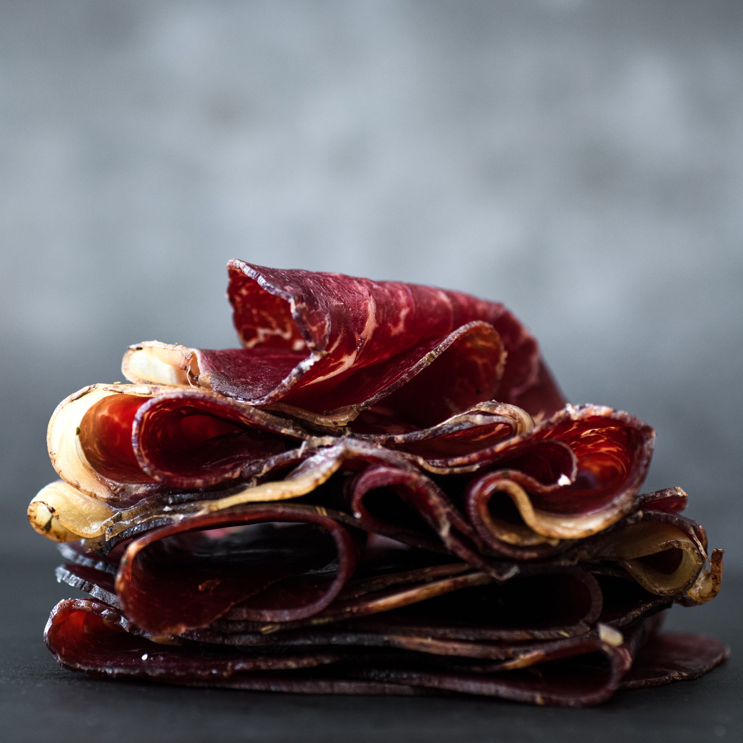

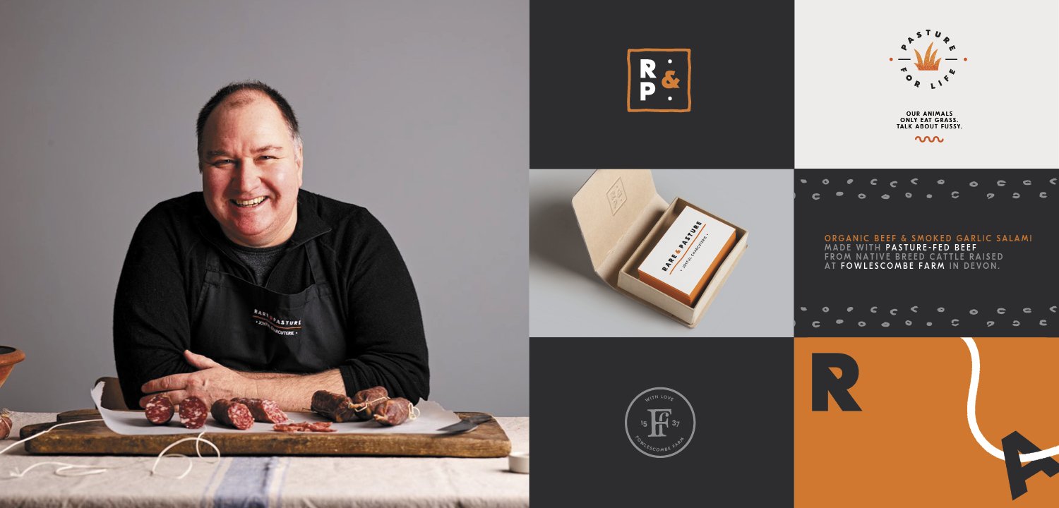
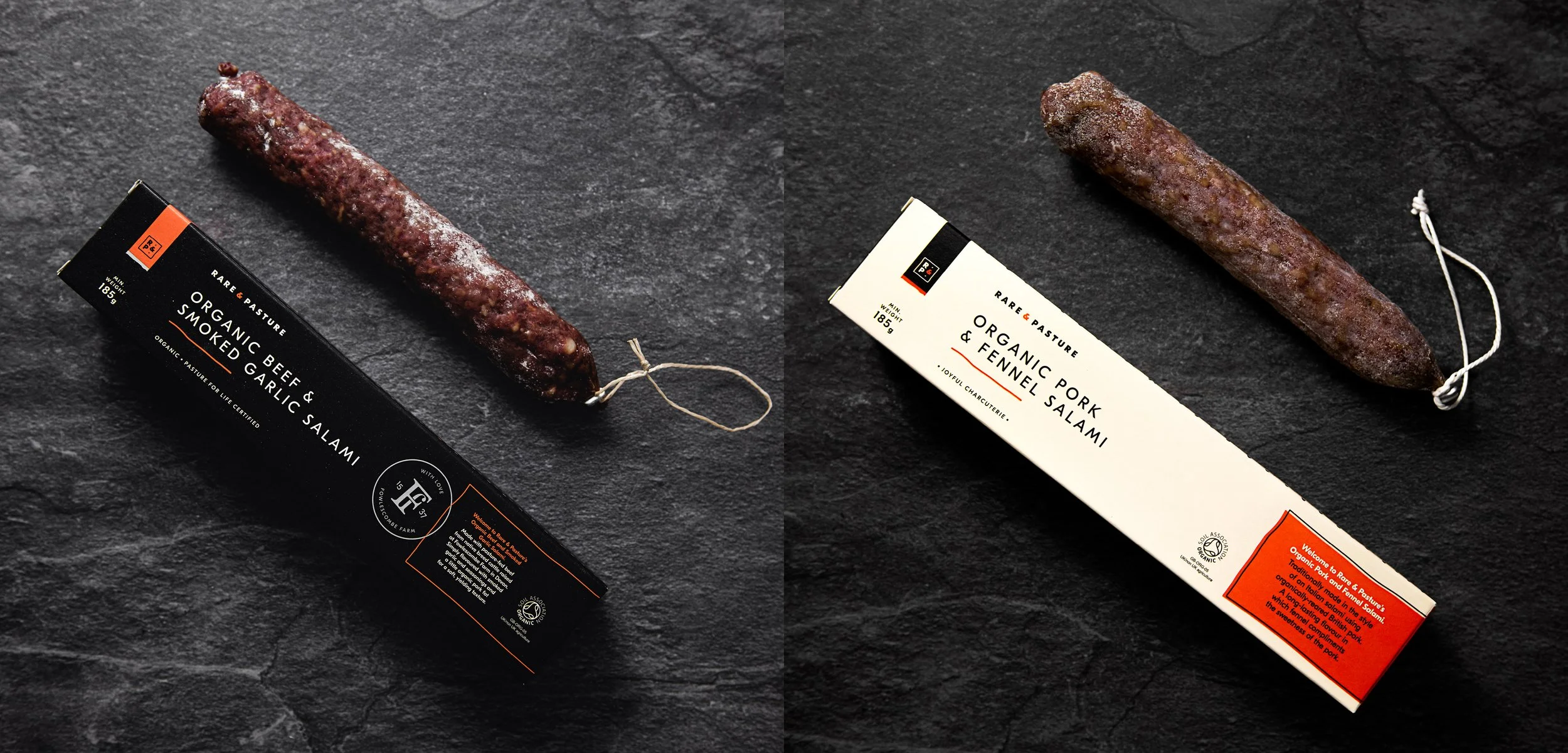
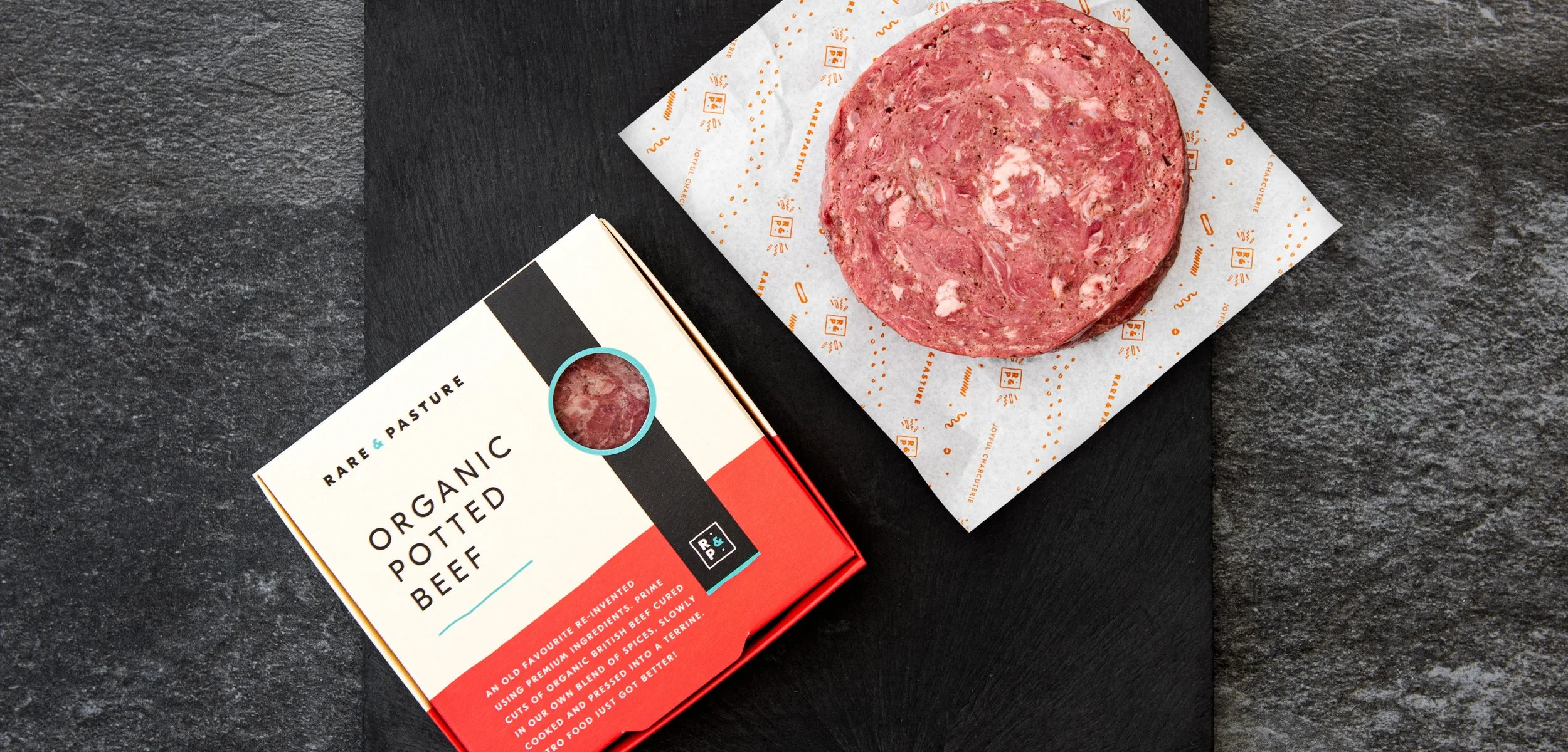
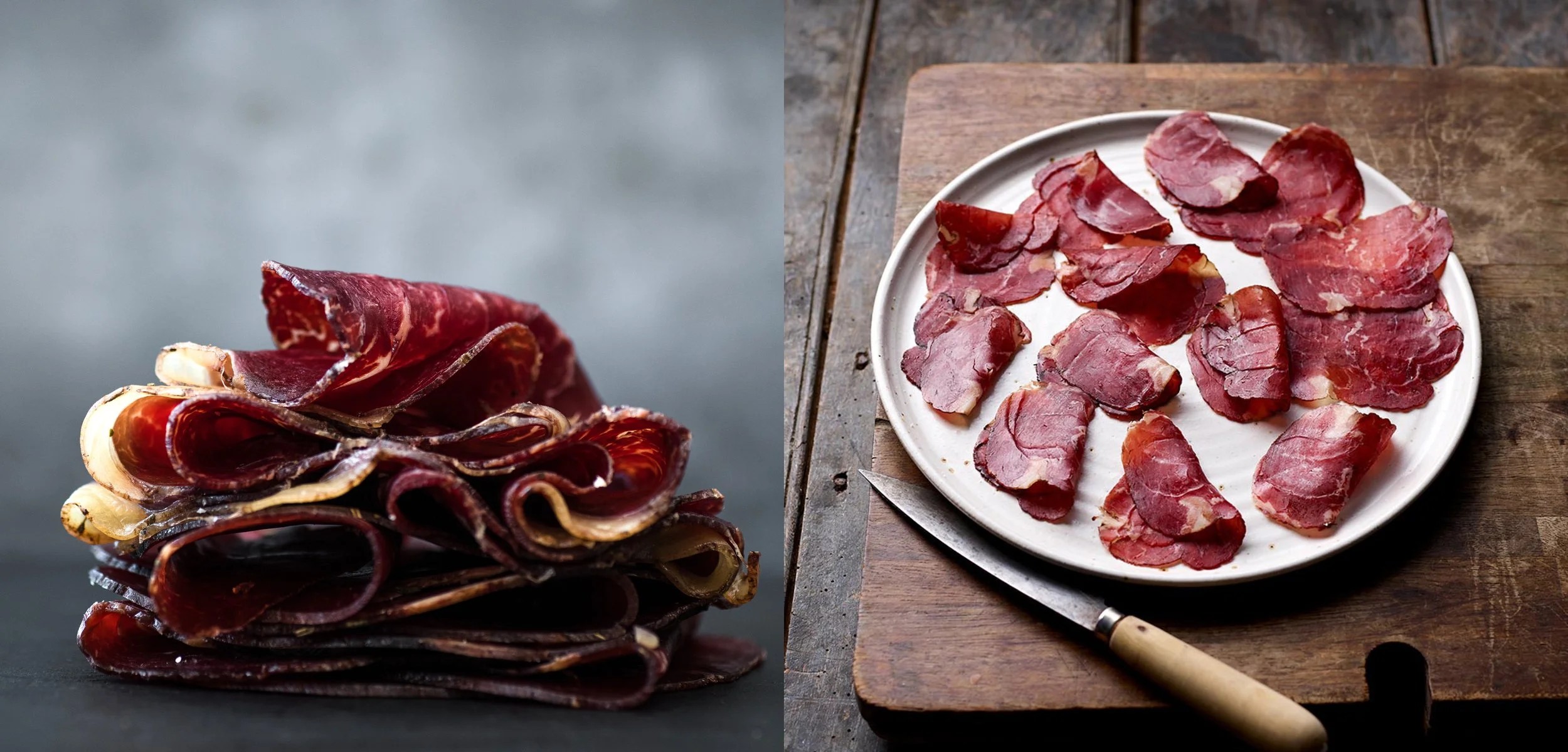
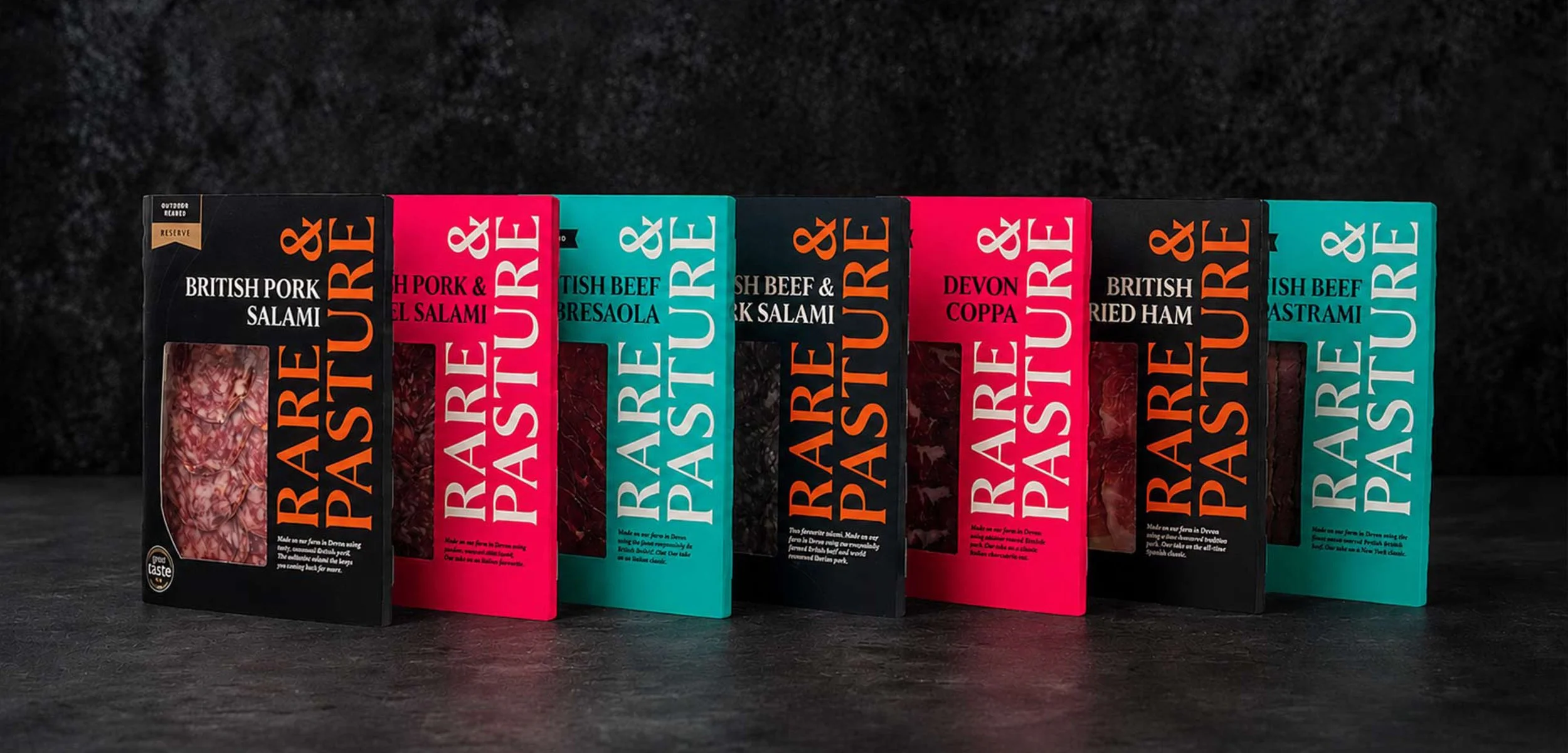

To bring the joy of charcuterie to everyone we have developed a characterful brand. The R&P stamp is used to signify quality. Together with hand drawn typography, vibrant colour palette and rustic illustrations we bring to life the high quality ingredients and exceptional taste. The brand has flexibility for a premium look and feel whilst retaining its joyful character for specially selected products.
As Rare & Pasture grew, so did its ambition.
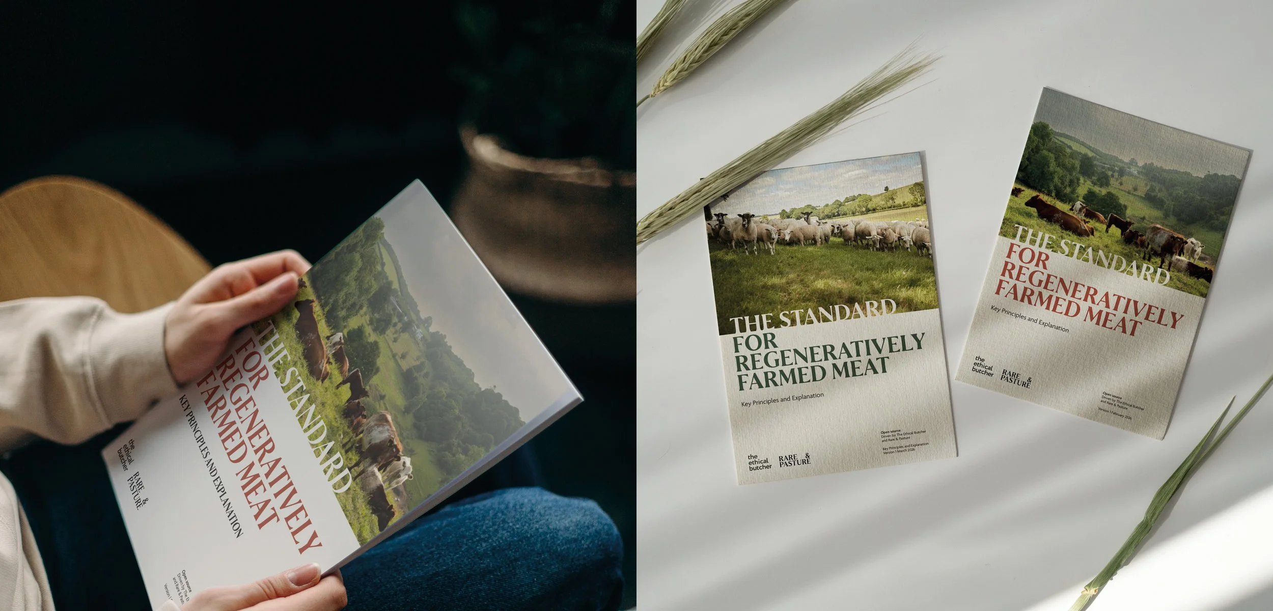
What began as an artisan charcuterie brand evolved into something much bigger—a business with the confidence to reach new audiences and help shape the future of regenerative farming.
Following the rebrand Hundreds & Thousands Design supported the rollout of the new identity, bringing it to life across packaging and print while ensuring every detail remained consistent from concept through to production.
Working closely with print partners, we refined artwork, colour specifications and production standards to create a scalable system that could grow with the business. Sometimes the most important design work isn’t creating something new—it’s making sure every touchpoint delivers the brand exactly as intended.